")
")

Every year, the latest website designs trends will make their rounds on the Internet. Since trends come and go, it can be hard trying to figure out which one to adopt.
Although it’s vital to update your website regularly, you shouldn’t be jumping on every fad that arises. Changing up your website design too often indicates that you aren’t considering the main goals of your site. This will, in turn, make it confusing for your users.
As a web developer in Malaysia, we’ve seen countless brands incorporate trends into their website – only to compromise user experience.
To ensure that your website provides the most optimal user experience, here is a list of website design trends to avoid.
#1 Parallax Scrolling
Parallax scrolling is a technique that moves the background image at a slower speed than the foreground, creating an illusion of depth on websites.
When used properly, parallax scrolling can enhance your website and captivate users. But while parallax can increase user engagement, it can be a harmful trend to utilise.
Since its effect is so immersive and dynamic, it can disorientate users while scrolling.
Even worse, you’ll realise that parallax scrolling adversely affects mobile responsiveness. With the booming population of mobile users in today’s digital age, your website design will turn a huge portion of your visitors off if it’s not optimised for their needs.
Rather than parallax, a safe choice to go for is the traditional vertical scroll. This is the most common type of scrolling on the Internet, and it works well because users are already accustomed to it.
#2 Hamburger Menu
Though a hamburger menu gives your website a cleaner look, it can make it difficult for first-time users to navigate around your site. As hamburger menus are small and take up little screen space, they are usually used for mobile sites.
Oftentimes, websites that work well with hamburger menus are content-heavy. Both YouTube and Reddit use the button effectively to organise their vast range of content, even on desktop.
But if you don’t have as much information on your website, using a hamburger menu as your primary navigation on the desktop will cause your content to end up unseen. Since your full menu will not be visible, people won’t intuitively know where they are or where they can go.
Think about the objectives of your website. Do you want to provide users with a deep range of content or introduce them to your brand?
If it’s the latter, you need to stop hiding your navigational buttons under a menu. Instead, consider using a sticky menu. Having your navigation fixed at the top of the screen while scrolling will make it easier for first-time users to find their way around the website.
#3 Pop-Ups
Pop-ups are annoying, disruptive and confusing. Yet, they are still used frequently to increase conversion rates.
Deemed as a major turn-off, pop-ups drive users away from your website. Users often perceive them as spam, which will negatively affect your brand’s reputation.
This common feature also distracts users from your website content, especially if its messaging is irrelevant or appears at the wrong time in the user journey. Eventually, this leads to poor user experience and high bounce rates.
If you still want to leverage on pop-ups, be conscious of how they value-add to your user experience. Don’t just ask users to sign up for your newsletter, create pop-ups that provide them with the information they actually need.
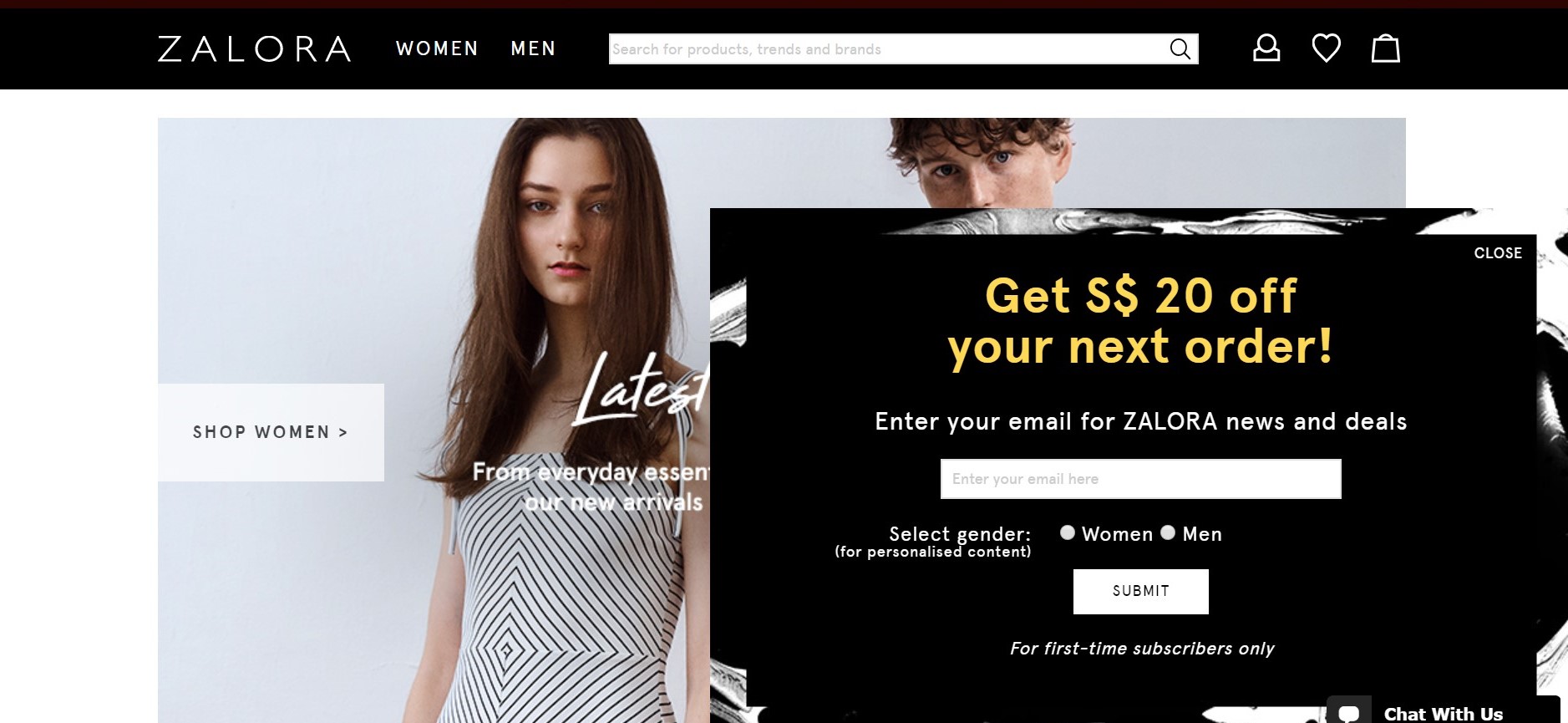
Taken from Zalora
For example, Zalora displays an effective pop-up that offers first-time users a $20 discount in exchange for their emails. This incentive will entice users to stay on and browse through the catalogue to utilise the promotion.
#4 Rotating Carousels
Forget flashy and cool, rotating carousels are just distracting and redundant.
You may think that rotating carousels are good because you can tell multiple messages in one space, but they are often overlooked.
Carousels that move to the next slide too quickly will only confuse users, while those that move too slowly risk letting users miss the other slides. Not only do rotating carousels slow down pages, but they also impact conversion rates and search engine optimisation.
Using a static carousel, or removing the design element completely, can be better off for your website.
Create A Trendy and User-Friendly Website Of Your Own
Good website design can take your brand to the next level. Staying on top of the industry trends is not enough – you need to know which trends to use and which to avoid.
Web design is about making users comfortable during their journey on your site. By leveraging website design trends in the right way, you are more likely to see repeated visitors and increased brand loyalty.
Ready to get a personalised revamp on your website? Contact our team to discuss designing a website that gives you the comparative edge over others.
