")
")
With the plethora of screens sizes out there for the various electronic devices, a responsive website design has become more important than ever before as people start turning to mobile browsing for all of their online activities. If your web design does not take that into account, you’re going to run into problems sooner or later.
A website design that adapts according to the screen size may sound like a challenge to develop, but with the help of a good web developer, you should be able to capitalise on the growing mobile audience.
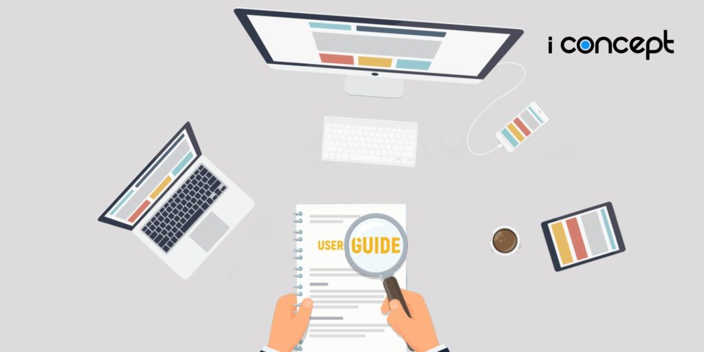
However, if you’re new to the digital sphere, we’ve put together a helpful guide for you, which covers everything you need to know about creating a mobile responsive website design:
Elements of Responsive Web Design
A responsive web design is basically a system for creating websites that can recognise and appropriately react to the size of the screen it is displayed on. It involves three core elements that are indispensable for it to work:
- Firstly, you need a fluid grid – it allows the size of the page to adapt to the size of the screen.
- Secondly, you require the flexibility of the visual elements being displayed i.e. images, text, which can be bigger or smaller or even swapped out accordingly.
- Finally, media queries help to display everything in your website design correctly.
CSS Media Queries
The HTML code stays the same for any website that is developed, what changes are the CSS media queries. A CSS media query essentially allows your CSS to be applied to different parts of your website, changing the way it’s being viewed on different screens.
For a CSS media query to work, you’ll need to have breakpoints in each section of your development.
Breakpoints
Breakpoints serve as the point for the visual element to change the layout or add/remove various elements to accommodate the screen size. As you go through the web design process, you’ll need to determine your breakpoints in order for them to perform effectively.
The best way to do this is to create breakpoints for sizes of monitors, phones and other devices that are commonly used. If you use these average sizes, you’ll eventually end up with the right breakpoints. You don’t have to worry about very minor screen size variations. (PHEW!)
Get Inspiration From Strong Examples
There are lots of websites out there that are already using responsive web designs and you can see the results for yourself. Make the most of the positive examples of responsive website design as you look for ways to improve your own.
It’s all about making sure that your website looks good on any device it’s viewed on. Take inspiration from websites that have already achieved that and you should be on the right track.
Test it Out
It’s important that you test out your new responsive web design on various screens. After all, the only thing that truly matters is how your website design looks and performs in different contexts.
By testing it out, you can identify any potential problems and make changes to anything that’s off from your expectations before fully implementing them.
You don’t have to literally try it on every device, there’s a developer tool for your browser that you can use to test it out!
A Step Further: Mobile-First
You might have heard of or chanced upon the term mobile-first, but what does it actually mean? It’s often seen as an alternative approach to adopting a responsive web design. As the name suggests, a mobile-first web design is a backward process, where you design for mobile devices first before implementing on the bigger screens.
While mobile-first ranking is being implemented across Google, it’s not mandatory for you to implement a mobile-first design. A mobile-responsive design for your website should work the same way and it also ensures that the desktop users are not neglected.
Closing Thoughts
Responsive website design is something that can’t be overlooked and it accommodates a huge part of your business’s target audience. Hence, we highly recommend that you do implement a mobile-responsive web design ASAP.
Still confused on how to go about it? Or perhaps can’t fit into your busy schedule? We’re here to help. Our website developers in Malaysia is confident that we can deliver a website that makes your brand look good on every screen and device.
Speak to our sales representatives to find out more!

