
Colours are involved in every element of a website design from the fonts to the menu bars to the images, and choosing the right colours improves your brand perception.
Given the significance of colour palettes in Malaysia web design, there needs to be more care given when deciding the eventual colours used. As an experienced website design company ourselves, it’s part of our mission to help design beautiful websites and we hope to offer our input here:
Complement Your Brand Colours
Most brands have logos and colours set out before proceeding to the website design phase. A website represents your brand, which means that the colours on your web design should correspond to your brand colours.
Use the colours from your logo as the primary colours for the key elements of your website, such as the menu bars, banners and Call-To-Action (CTA) buttons. On the flip side, the other elements should be in contrasting and complementing colours to make the main components stand out.
It’ll be worthwhile for your website design to match your branding, especially for your marketing efforts. That’s the experience we’ve had in our digital marketing services for our clients.
Pick It Based On Emotions
We don’t mean pick based on your emotion but base it on the emotion you wish to convey on your website.
The main reason that colours are so significant in design is that they communicate and incite the right emotions when used strategically. Hence, it is common for brands to pay huge sums of money for branding projects, due to the impact and value that it brings.
Each industry needs to convey different emotions, which is why they will require different primary colours and colour palettes. Subsequently, your website should also follow the psychology of colours to achieve your business objectives.
Picking the correct colours, right down to the shade, matters for web design.
Even a web developer like ourselves also cater to colour psychology.
White Space, White Space, White Space
Always cater for white space in your colour palettes. ALWAYS.
In case you’re unaware, white space is the space in your web design between each visual element. It doesn’t necessarily have to be white, as long as it’s a contrasting colour that makes the various visual elements readable and legible.
Ensure that there’s an abundance of white space throughout your website design, which will help provide more emphasis to your CTAs and overall balance to it. In addition, it also provides a resulting clean and modern look to it.
Use A Tool
You don’t always have to take things on your own – there are a lot of resources out there to help. Besides approaching a web design company, there are great online colour palette generators, such as Coolors, that can generate and adjust different colour schemes based on your primary brand colour.
Perhaps you would like to create a colour palette based on a very beautiful image instead. Well, that’s possible with Canva’s colour palette generator – simply upload the image and they will generate a colour scheme for you.
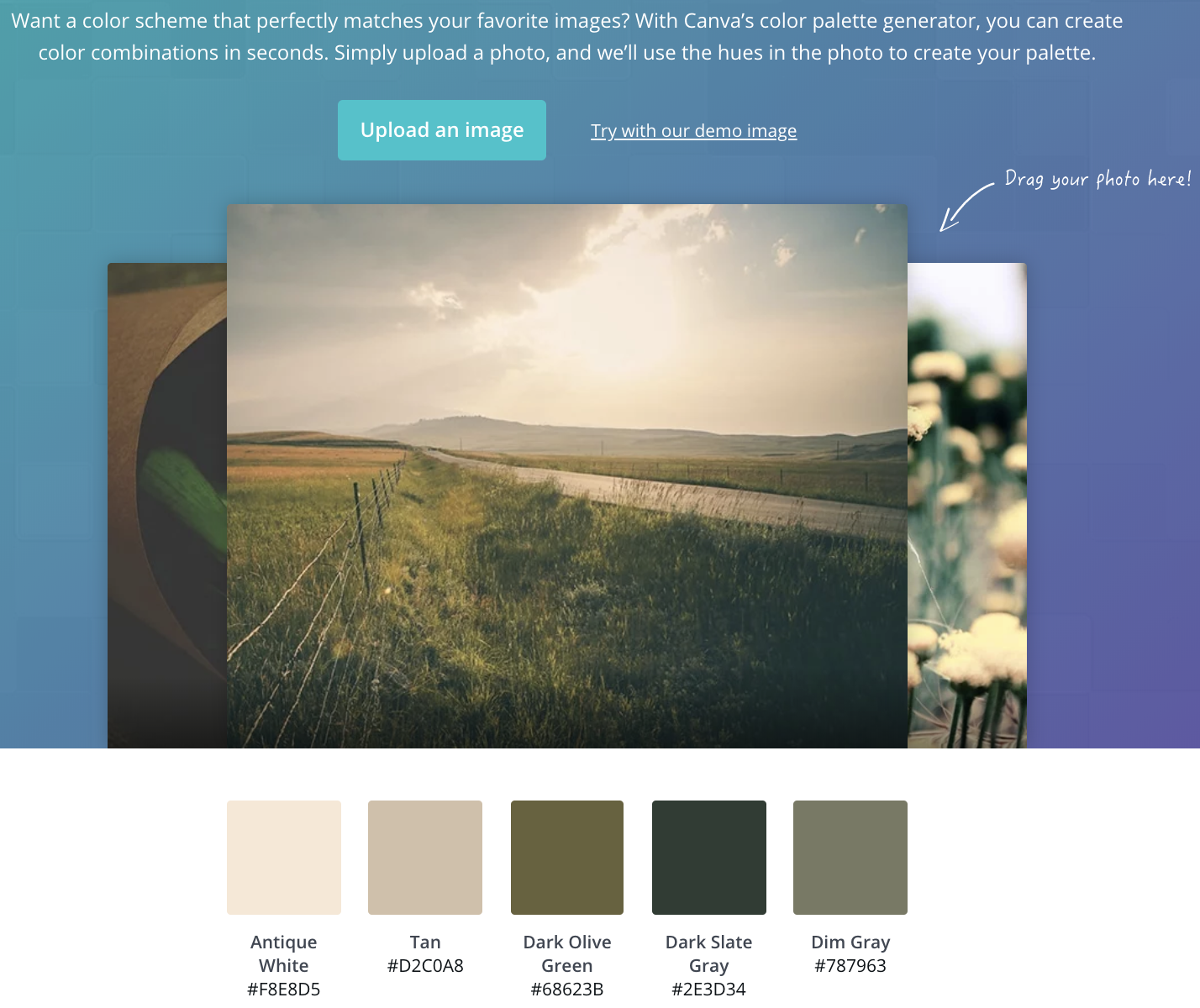
(Image: Canva)
In fact, you could even use these tools to generate the primary colours for your brand and logo that you like and wish to use.
Wrapping Up
Having the right colour palette is a good start, but it’s just a component of website design in Malaysia.
If you are looking to take the next step for your website, it’s time to bring in professional help. With our eye for aesthetics and experience in design, I Concept could be the web designer you’re looking for. Speak to our consultants today for a better understanding of our services and past works!