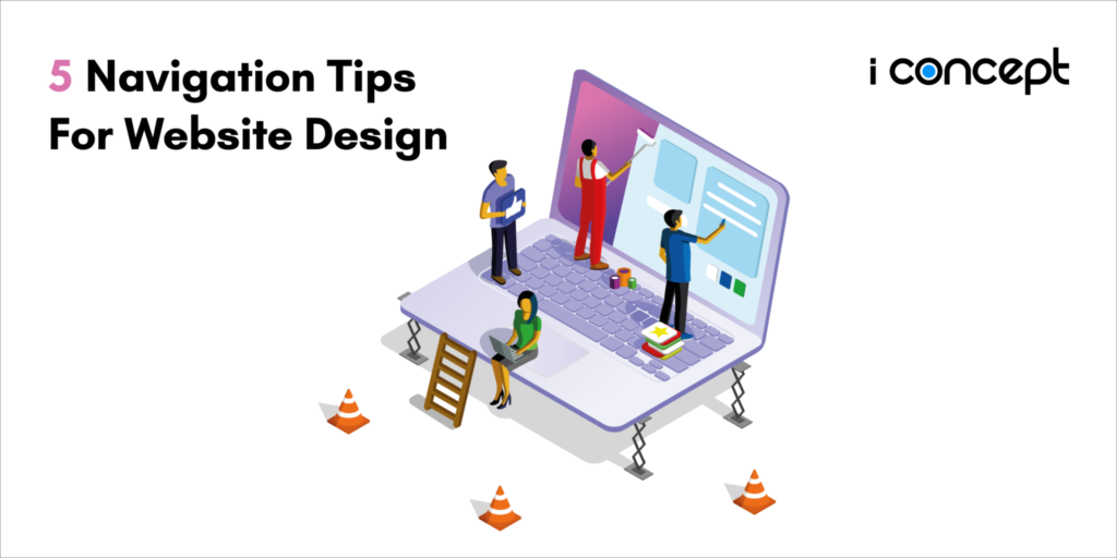
There is no harm in letting beauty be in the eyes of the beholder — but that doesn’t mean a few guidelines for web design would hurt. Having a solid website navigation structure can be key to converting your web visitors to consumers. Keeping in mind several pointers — like simplicity, linking your logo to the homepage, identifying broken links, incorporating search functions and organising content in order of importance — are small tweaks that can bring about big changes. So if you’re looking for a web designer in Malaysia or designing a website on your own, here are 5 navigation tips to make sure you’re on the right track.
-
Keep your navigation bar simple
Think simple and intuitive. That’s what your navigation bar should serve. Ideally, you want users to quickly fulfil their objectives of being on your page and take the necessary action. So with clear copies and design, this should help users to locate for what they are searching for in the quickest time possible. Clarity is key when thinking about the design of the menu bar and its copy. You don’t want to be talking about apples when you’re actually selling pears. Keep creative copywriting in the actual body content of your website instead. This also means you can avoid cooking up a fancy design for your menu bar. The lesser time a user spends on navigating can equal to a lesser time spent on the consideration process of a consumer decision journey. Remember, streamlining just what you need at the menu bar is contributive to achieving an overall seamless User Experience (UX) for your web design.
-
Link logo back to the home page
How many times have you come across a website where you click on the logo and it leads you nowhere? Because we’ve all been catfished just about that many times as well. Make it a point to link all your logos in your web designs back to the homepage. That is the easiest way a user is able to trace back his clicks and relocate for what he’s searching for. Having your logo link to the homepage is also a great way to keep track of their user journey in the case that your website does not offer a breadcrumb navigation. Consider design, placement and size of the logo in order to capture a user’s attention and not disorientate them. It is also almost intuitive that users habitually click on the logo to steer back to the homepage. You don’t want to play with their feelings by depriving them of the necessity of a homepage link.
-
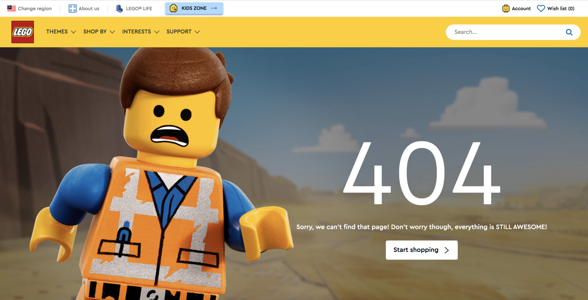
Identify error 404s or broken links
A generic Error 404 page, a broken link or a missing image can be detrimental for your website. It can harm an organisation’s credibility, lose potential consumers and eventually harm the website’s Search Engine Optimisation (SEO) efforts. There are many ways to go about fixing broken links. To ensure you nip it in the bud, consider installing a plugin or check for broken links online to ensure that these are immediately identified. You could also take this time to design a custom error 404 page to cushion the disappointment of a user landing on a broken link. Here’s a great example of a unique error 404 page from LEGO® Malaysia:
-
Include a search function
If you’re designing for an ecommerce or a content-heavy website, a search function is more than necessary. With that being said, your search bar needs to be completely functional and purposeful as well. Essentially a search bar leads your users to a page that they could not have easily found it on their own. Hence, a search bar should be strategically placed at the side of your menu bar and this allows first-time visitors to easily explore your website further. This can possibly be your key to reducing bounce rates on your website. Let’s take a look at how FTMS International (private college in Malaysia) and how they used a clean icon to indicate the presence of a search bar:

-
Establish an order
The serial position effect is the ability to recall the first and last things a person hears or sees. In website navigation, this can be applied just the same. Items that appear first in your menu bar are more likely to be remembered (primacy effect). Items that appear last are more likely to be recalled as well (recency effect). The order in which users view the items on your menu bar can be viewed in the same way. Things that are viewed first or last are more prominent to a user than anything else they view in between. As such, key pages such as product pages, contact page or anything crucial for the business should be placed at the start or end of your navigation menu.
In essence, your navigation bar should direct users to where they want to go or where you want them to go. This includes making sure that the steps taken in between are carefully accounted for as well. Of course, there is no shortage of web design tips out there, but ultimately, usability and functionality is the root of all great website designs. Are you looking to cut through the clutter? Let us be the solution to your next great website design.