")
")
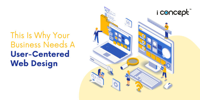
If you haven’t noticed, website design terms have largely revolved around 3 keywords:
- Mobile-first
- Responsive
- Desktop site
So what’s the difference? Thank us because we’re gonna help everyone out by sharing what responsive web design is and how does a responsive web design benefit you.
What is a desktop design?
A website set up to look best in either one of the following dimensions – 1024 x 768, 1280 x 1024, 1920 x 1080… which is large for a tiny mobile device screen. It can be feature-rich but it’s going to be hard seeing everything if you’re viewing it from an iPhone screen. Let’s not imagine the clutter, ugh.
What is a mobile-first design?
A website set up to look best on smartphones or portable devices. Cheaper and functional if your main target audience is viewing your site on mobile devices. Best part? It pleases the search engines because Google looks at your mobile design, first. As literal as it sounds. Bingo!
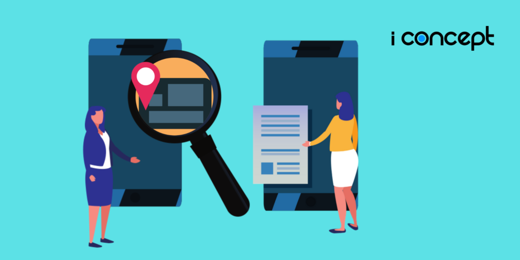
What is a responsive web design?
A website that optimises and responds to whatever device you are viewing the site on regardless of whether desktop or on a smartphone. Now, this is where the magic happens!
If you’ve guessed it by now, having a responsive website design is, of course, akin to having your cake and being able to eat it. You get the best of both worlds – a site that adjusts its buttons, layout and amount of information so you don’t have to pinch and zoom on your small iPhone or Android screen like a caveman.
It’s the 21st-century guys
Why does one need a responsive website design then you might ask, well, it is to provide viewers whether on mobile or desktop, the best user experience possible when using your site. Spending so much money on your website to make it functional and aesthetic as possible, wouldn’t you want your viewers to enjoy that? Maybe even make a purchase or subscribe while they’re on the site.
Big or small?
How does a responsive web design react accordingly you might also ask? Well, it starts in the layout. Large, touch-friendly Call-to-Action buttons allow you to easily click on menus, “read more” and “buy now” and are signposts for viewers to understand where to go next. No more angrily pressing the screen in hopes that you might hit the right button sometime this year.
Next up, depending on the layout and amount of information presented to the viewer, it can either encourage them to read more or smash their phone in frustration. Strategically minimising the number of icons, information or summarising text into a sentence can go a long way when users want their information quickly and at their convenience.
A journey of a thousand miles begins with a single step
Lastly, an optimised user experience for a desktop and mobile site can increase your conversion rate too. Do your audiences want to read more on desktop or do they want to quickly buy items on your mobile site and bugger off? One of the ways to improve your user journey is to understand your audience wants and needs like their pain points/frustrations. Start from what they don’t want.
Play the Google game
Changing from mobile or desktop to a responsive web design is a no-brainer. By ranking higher on google search because of your user-friendly site, this leads to more website traffic which ultimately leads to revenue for your company.
Now that we’ve cleared the air on those three terms, understanding what your needs are will be your next step. If you think you know what you need, drop us a message and we’ll be more than happy to work with you.
