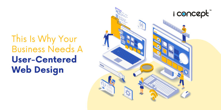
Continuing education online or learning new skills during lockdown has become a large part of the new stay home or quarantine lifestyle of late. For education providers, this could be time to work on building your online presence through tips such as responsive web design, use of colour theory, typography and curating the type of content that visitors to your site would want to know before engaging your services. We know education or learning is a life-long process (ha, cheesy) but hey, who’s to say teachers or providers can’t continue learning how to better themselves, skills or refine the services they provide? Now that we’ve got more time at home on our hands, let’s get cracking with web design tips for those in the education sector.
Mobile-first and responsive design
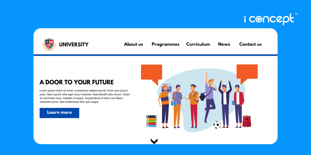
In an age where many if not most, searches are done are via a mobile or desktop device, responsive websites are the future. Mobile-first design and responsive website designs are the go-to in terms of maintaining the best user experience across all platforms. Mobile-first design refers to designing the smallest screen first and working your way up to larger screen sizes. This is due to an increase in mobile device usage and searches online. Responsive web design responds to the user’s behaviour and environment based on screen size, platform and orientation. This helps make your website to everyone, regardless whether they’re waiting for the train to arrive, or just comparing education providers. Every advantage counts in the digital sphere. You can check out our I Concept home page for an idea of how responsive design reacts to your device!
What we recommend – go with mobile-first and responsive web design and keep it modern within your brand guidelines
Applying appropriate colour theory
Colour theory is the use of colour to artfully enhance the story you tell with other elements. It can be used to set the mood or direct attention. How often is a website you visit, with poor usage of colours? Kind of turns you off doesn’t it? Therefore, having the right colour palette for your website can make or break it. Here’s how UOW Malaysia KDU integrates blue, white and red into its design so tastefully. Universiti Malaya also utilises colours from its logo – blue and red on its website to reinforce the brand as well as convey prestige from its long history as one of the top universities in Malaysia
What we recommend – find a colour palette that suits your brand, usually around 3 to 4 colours. Some colours we can suggest are dark blue – professionalism/prestige, white – modern/clean, red – passion/power.
Choosing the right font/typefaces and typography
If you have read some of our previous articles, typography has been a big part of web design. It’s what your visitors read and the first thing they interact with. Imagine if your font looked like this. Or it looked like this. Or even this. You would trust an education provider with a font like this more am I right?
Harvard Business School’s brand guide uses Trade Gothic as their brand font. A local university, Universiti Teknologi Malaysia uses Calibri as their tagline typeface. You can even check out other non-education brands for website design inspirations!
What we recommend – depending on the look and feel you’re going for, decide on serif or sans serif and then find a font which emphasizes your brand image. Something strong and bold for those looking to make a change in the world or serif font for an institution with a storied history.
Quality Content
Content is king, or so we like to say. Having the right content in the right places can lead to conversions or leads in general. When crafting content, you have to think about specific audiences or whether you want to encourage visitors to complete an action. This can mean the difference between visitors choosing your site or a competitor. Here’s how FTMS Global College uses copy to convey its point across.
What we recommend – use a mixture of both in different areas. For the homepage, you can craft certain segments to attract certain demographics. Example – “student deals for existing students” or even “part-time courses are available”. To encourage visitors to complete an action, a copy like “register an account now to qualify for an early-bird discount” can be used.
Now that you have an idea of what we would recommend for an education website, drop us a message if you have any upcoming plans. If not, check out this article about the best website design tips of 2019/2020 wrapped up.